Overview: The "fred again.." Wordmark, Explained
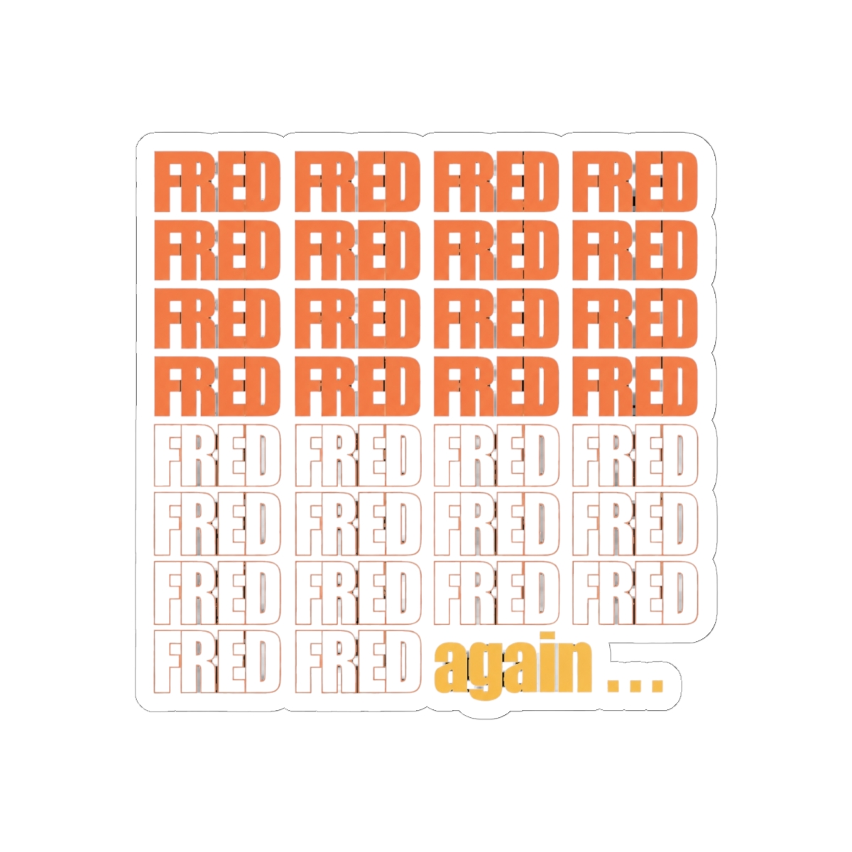
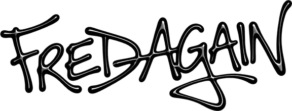
There's no crest, no mascot, no chrome monogram. Fred Gibson's visual identity is a lowercase wordmark with two dots trailing it: fred again.. Those dots are the logo. They sit on the Actual Life cover art, they show up on the screens behind the drop in "Delilah (pull me out of this)", and they're what people mean when they type a Fred Again logo search into Google.
That's the honest answer, and it changes how you should buy merch. A wordmark has nowhere to hide. There's no colorway to distract you and no illustration to carry a sloppy print job. If the letter spacing drifts or the ink bleeds, you'll spot it from across a room. So the question worth asking isn't "which design" - it's "does this printer respect the mark."
The second half of the identity lives in the artwork. Three Actual Life volumes landed between 2020 and 2022. Ten Days followed on September 6, 2024. The grainy, overlaid photo style from those covers carried into his tour visuals and the 2022 Boiler Room London set. Head to his socials in 2026 and you'll see the same lowercase mark, unchanged, doing all the work.